Teta Drugstore
branding / logo / visual identity / design guideline / magazine layout / interior design
Teta is a chain of drugstores operated by the Czech company p.k. Solvent, which has been active in the wholesale and retail markets since 1992. Initially, the company had stores in smaller towns. In 2012, the company decided to further develop its own retail network and enter larger cities in the Czech Republic and Slovakia. Teta drugstore chain now has more than 800 own and franchise stores.

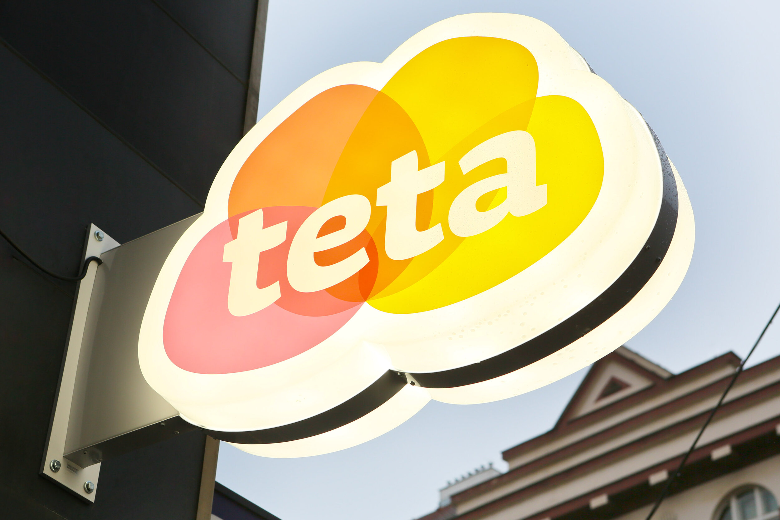
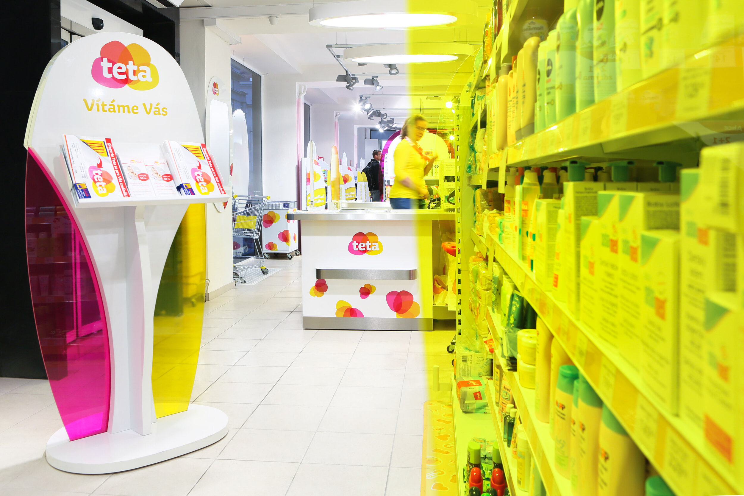


Due to the new market situation, the company decided for a fundamental rebranding in 2012. The basis of the new visual identity is a distinctive logo composed of four overlapping leaves that together form a flower, they evoke the freshness and aroma of nature and at the same time resemble a swatch or fan of colours. The motif is repeated in other graphic elements, the two colour versions differentiate the drugstore range from cosmetics and help to guide the customer through the store.
After rebranding, sales in new stores increased by an average of 30%. The project was nominated for the 2013 Czech Grand Design Awards. In 2015, the rebranding won the gold Effie Award Czech Republic in the Other Services category.
Role in the project: co-author, creative director, design supervisor, graphic designer.
Created for Dynamo.