Creditas Bank
branding / logo / visual identity / design guideline / communication campaign / print materials / interior design / digital / motion design
For twenty years, Creditas has offered its services as a credit union, and in 2017 it entered the market as a bank. The mission statement of Creditas Bank is to give a safe conservative evaluation of savings with an emphasis on quality customer care. The bank's core values are tradition, stability, trust and clarity.


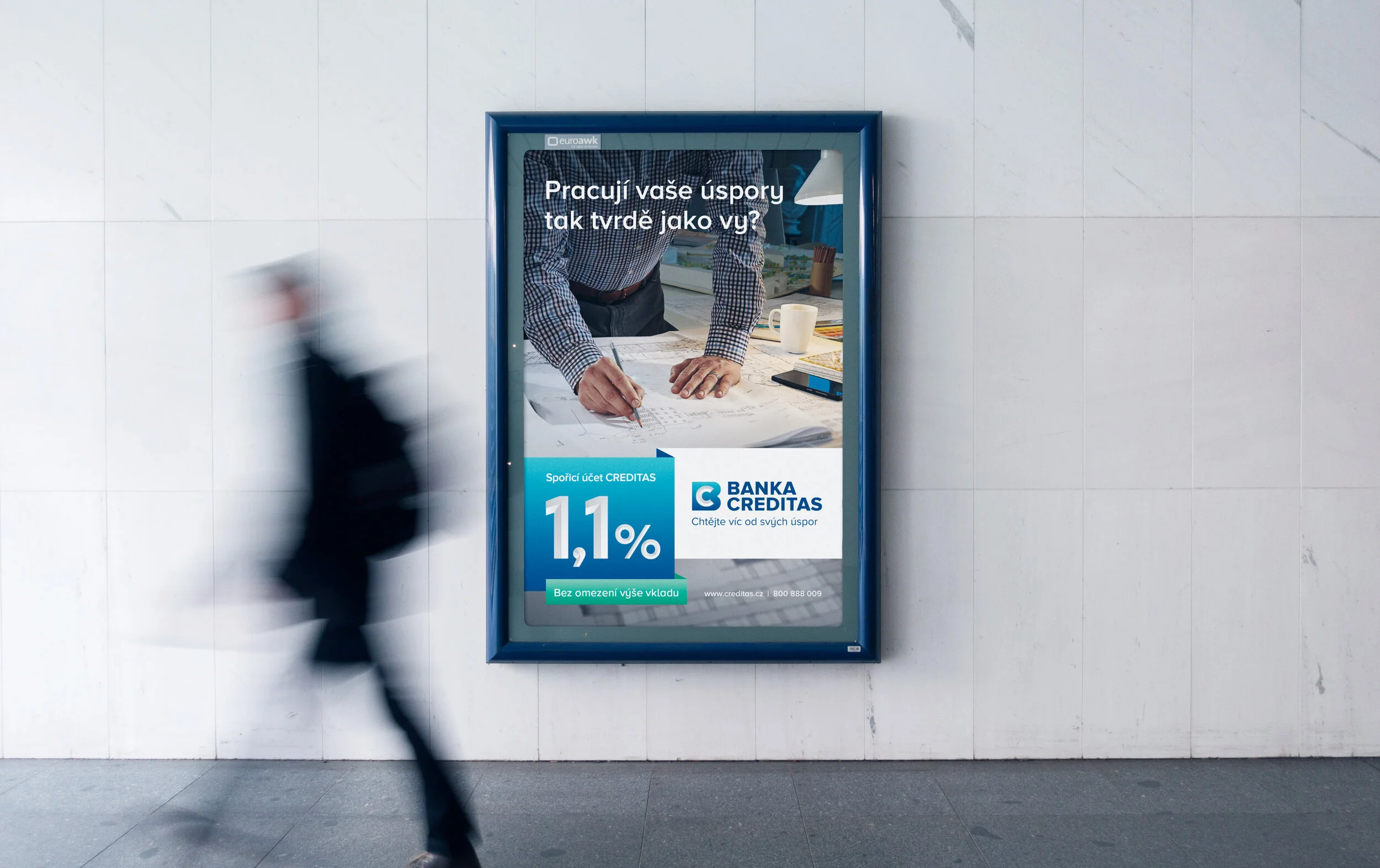
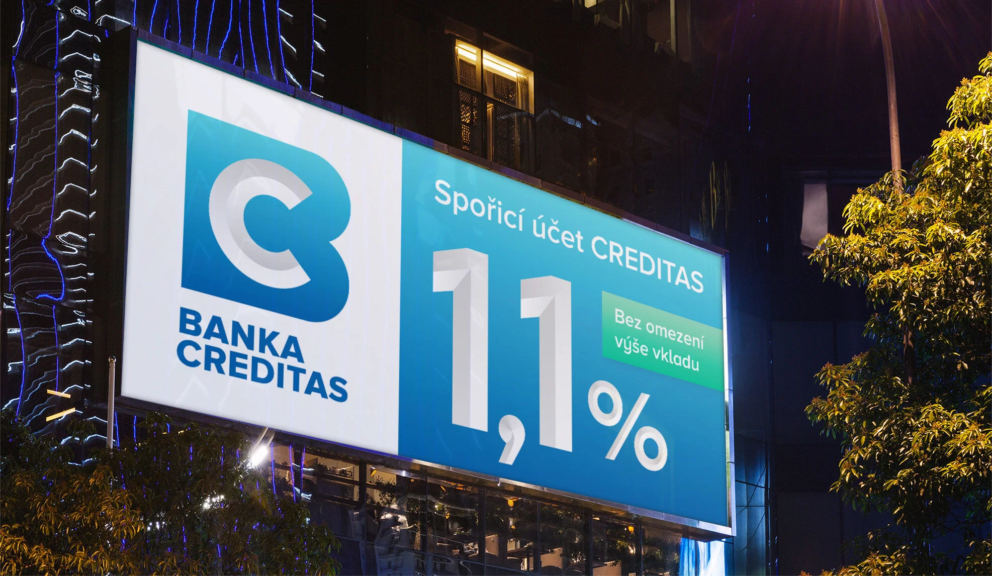


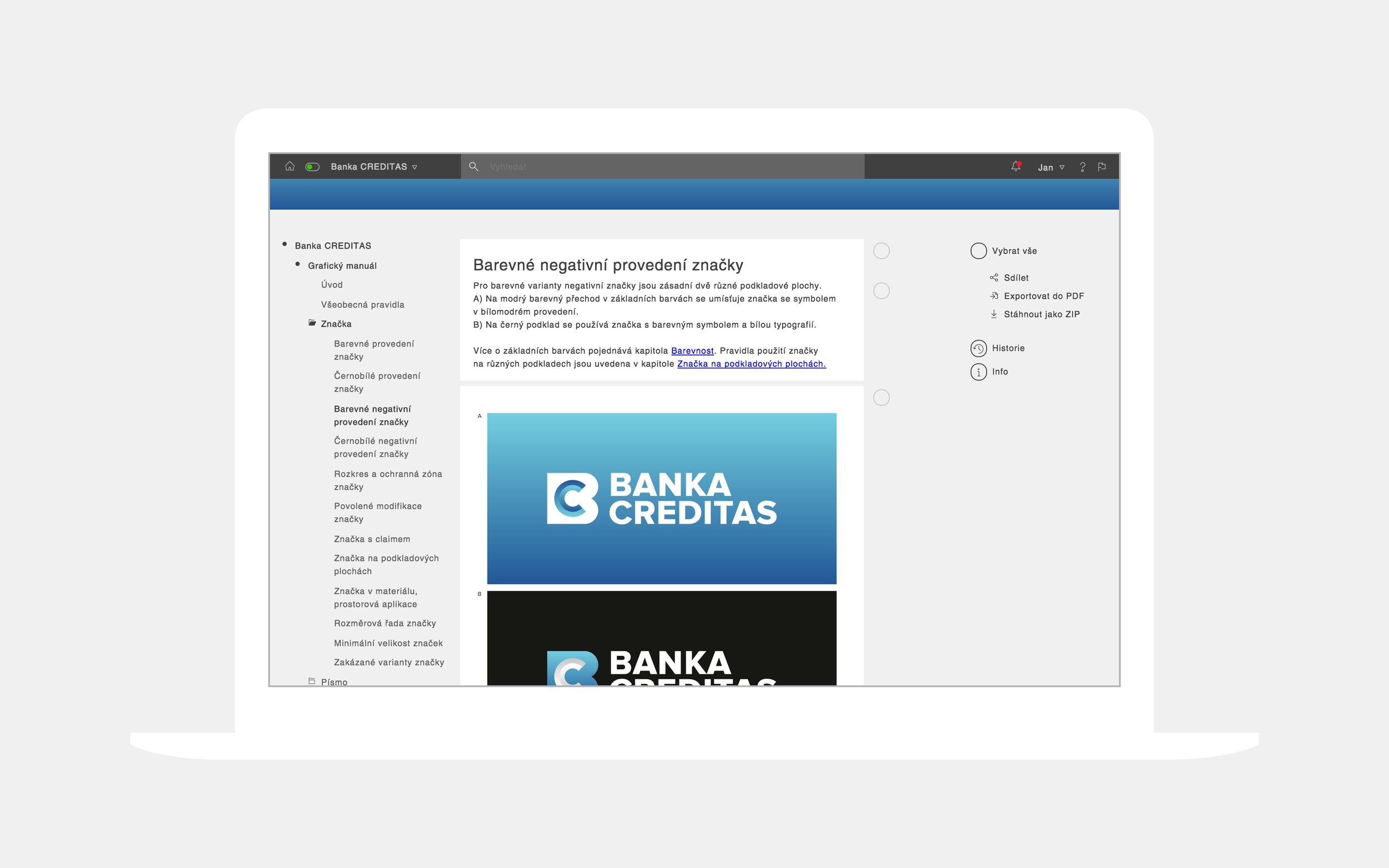


The basis of visual communication is a new distinctive logo with a symbol created from the initials of the company’s name. The letter C is surrounded by a protective zone symbolising a locked safe in the form of a blue letter B. This concept communicates the security of finance guaranteed by Creditas Bank. The reference to tradition and stability is represented by the plastic grey letter C, which is carved in stone. This graphic principle is further applied in a set of custom designed digits and other characters. The overall visual style is stable, serious and trustworthy, which was the main requirement of the client.
After the rebranding, Creditas Bank almost doubled their number of clients in the first three months and the volume of deposits increased from 10 to 26.4 billion crowns in the same period.
Role in the project: author, creative director, design supervisor, graphic designer.
Created for Dynamo.