Czech Volleyball
branding / logo / visual identity / design guideline / print materials / motion design
The Czech Volleyball Association has almost a century of history and is an official representative of Czech volleyball and is at the forefront of the development of volleyball in the Czech Republic. Czech volleyball also includes beach volleyball, mini volleyball and snow volleyball. Recognised by the International Volleyball Federation (FIVB).


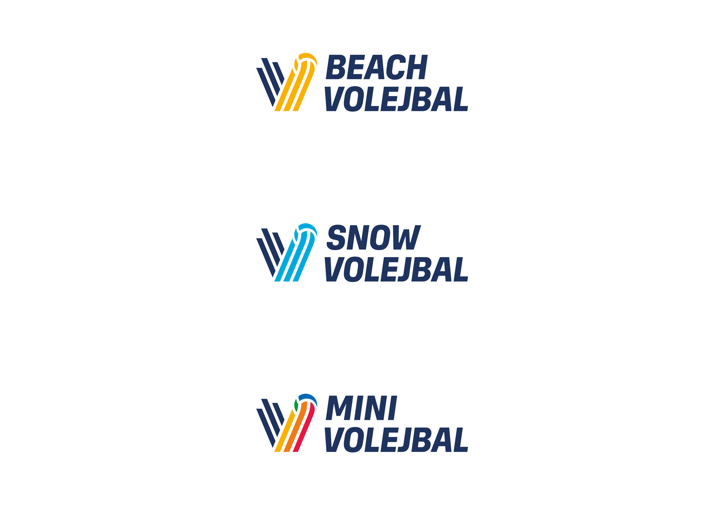


The symbol in the new logo is a bounced ball, the trajectory renders the letter V which refers to the words volleyball and victory. The rebounding ball symbolises an ace and a point of service. The selected color scheme strengthens the perception of Czech volleyball as a backing national organisation for this sport. The dynamics of the new visual identity are supported by asymmetry in the symbol, inclined typography, photographs of the players in typical poses and red-blue stripes passing through the graphics applications.
Role in the project: co-author, creative director, design supervisor, graphic designer.
Created for Dynamo.